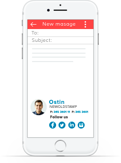
Do you have an email signature already? No matter if you do or think of creating one, our list of the best design trends should come in handy!
Email Signature Design: Top 5 Trends
There are no strict rules related to the design of email signature. However, looking at some of the most successful professionals and their signatures, we can see certain tendencies. Based on this, we have defined the most popular email signature design trends that, hopefully, will help you create an excellent stamp that works.
1. Mobile Friendliness
In the era of mobile devices, you can’t ignore their impact on people’s lives. By saying this, we mean that mobile-friendliness of everything you do is not a possibility but a necessity. At least half of email users, open letters using their tablets and smartphones. Thus, you should design your signature with this in mind!
If your stamp is not mobile friendly, at least half of your recipients won’t be able to see it. This means its effectiveness will also drop by at least 50% and this is a huge loss! Think of it when thinking of a device.
How to make your design scale for mobile devices? The main thing you should be thinking of is the screen’s size. The screens of mobile devices are much smaller than computer ones, which is why you should create a design that will work well on both. Also, don’t forget to test the completed design to see if all icons, links, images, and buttons work and are noticeable.
2. Not Too Many Images
Completing your design with a logo or photo is a big trend. However, in our article, we decided to focus more on another important trend – it is good to add images, but you shouldn’t make the whole thing one big image. Try to keep it simple and don’t overload your design with visuals. After all, images may not display as supposed, which will make your signature look bad.
3. Harmony And Simplicity
You should see the harmony between all elements of your design. To reach harmony in your design and keep it simple, try to be deliberate in the choice of colors. Using colors that don’t really match or too many of them, you risk making your signature look too flashily. The use of too dull or bright colors can also have a negative effect. One of the trends recommends choosing the colors from a company’s logo to enhance branding and tie your signature to the corporate style.
Also, be sure to choose fonts wisely. This is another thing that contributes to the harmonic and neat appearance of your signature. If you use too many fonts or choose one that is too fancy, this will be distracting and difficult to read. Eventually, this will make you look unprofessional. Here is a tip you can use: if you think that certain information has to be highlighted, try using different colors and sizes instead of using multiple fonts.
4. Wise Use Of Space
Another big thing in email signature design is making the best use of space. This doesn’t mean that there should not be blank space in your signature but that you need to use the available resources right. Think of an appropriate hierarchy. Make sure that you draw the audience’s attention to the most important data. Try these tips to do it:
- Adjust the size, color, and weight of the font;
- Position all elements of your signature according to their value;
- Play around with alignment (for example, left alignment is the best for making your text easy to read);
- Use dividers to structure and organize the information you have.
5. Less Is Better
What does a perfect email signature consist of? It is your business card and presentation of you as a professional. Therefore, our last trend is all about doing less to have a better result! First of all, your signature needs to convey your contact details, and you have to provide it in a neat, simple, and appealing way. Thus, the less information you provide, the better results you can have.
Try to focus on the important details. Instead of giving too many contact options, define the top ones that are the most convenient for your audience – a phone number, Skype, and email is enough! Also, do not include too many links and social media icons. Try to narrow down the list to the most popular channels like Twitter, LinkedIn, Instagram, and Facebook.
Email Signature Don’ts
Now once you are aware of the top trends in email signature design, let’s look at a few things that you shouldn’t do.
Animations
Unless such elements contribute to the overall image of your company and look amazing, don’t add animations and GIF to your email signature! Only rarely this looks good. In most cases, animations look inappropriate or even unprofessional. To complicate matters, not all email clients can display such visuals correctly, and this is something you have to keep in mind when working on your design!
Bullet Points
While bulleted lists perform great in different types of content and play organizing and structuring roles, in the signatures, they have an opposite effect. Different email clients display bullet points differently. This can negatively affect the overall image of your signature. Thus, we recommend avoiding them at all.
Too Much Effort
Email signatures can become strong assets for your business. However, this does not mean that you have to be too hard on yourself while designing it! There are many simple and smart ways to create a top-notch signature. For example, you can use an email signature template and a special generator to keep things simple and not get too much stress.
Alt Text
Don’t forget about it! While not all images may be displayed correctly, the image’s alt text is always there. By adding it, you will give all of your recipients an opportunity to understand what an image stands for, even if they can’t see the image itself.


Leave a Comment